My Experience Designing with React & Tailwind


Back when I was working as a Project Manager at an e-commerce agency, I’d work with both design and engineering teams to build websites. We designed all of our web projects in Figma, and we’d never formally kick off development until at least the first set of designs had been approved by the client.
So, when I met up with a friend who’d taught herself how to code during the initial lockdown phases of COVID, I was surprised to learn that she'd built a few personal websites without ever opening a design file. I felt like that’d be an odd process, to practically be designing her projects in code without having a design file to reference - complete with a style guide, reference imagery, and selected fonts, padding, colors, etc. How could you just jump right into coding without having a design outline beforehand?
And then, just like that, I was tasked with creating my first React project as a part of Phase 2 at Flatiron School in Denver. (Side Note/Shameless Plug: You can check out the result of that project on my GitHub, here).
One part of the initial requirements was to build out a wireframe, which was incredibly helpful for me to plan out the actual React components that I wanted to create. Knowing a bit about Figma, I whipped together some rough wireframes there and began to plan the project. Other than that, though, I decided to not actually design or prototype any concrete page designs within Figma itself. Instead, I told myself that I’d design from scratch completely, while also teaching myself how to use Tailwind CSS at the same time. So, let’s jump into what that process was like!
Getting Started with Tailwind
After getting set up with Vite + React, it was time to install Tailwind. Being new to programming overall, and using Vite for the first time, I was nervous about getting Tailwind installed especially since I’d first started building out some basic components with regular ol’ CSS. Installation, though, couldn’t have been easier, and I was later about to rewrite some of my class styling directly in line within my React code.
To get started, I followed Tailwind's Installation Instructions which created my postcss.config.js and tailwind.config.js files. There were a few additional items that I needed to configure myself, specifically loading a local font & a Google font within Tailwind.
Loading Custom Fonts in Tailwind & React
- Custom / Local Fonts
After scouring the web for a nice wiggly font for my website, I found a font called Hipnouma (LINK). I downloaded the font files and saved them in the /assets folder within my project directory. From there, I needed to get that loaded within my actual CSS file, index.css. Here’s what that looked like:
//in index.css

@font-face {
  font-family: 'WigglyFont';
  src: url('../public/Hipnouma.otf') format('opentype');
}
As you can see, I gave the font the name of “WigglyFont,” because the font is, in fact, quite wiggly.
From there, I needed to make some changes to my tailwind.config.js file. Within that file, I was able to import my custom font within the theme section. Here’s what that output looked like:
//in tailwind.config.js

/** @type {import('tailwindcss').Config} */
export default {
  content: [
    "./index.html",
    "./src/**/*.{js,ts,jsx,tsx}",
  ],
  theme: {
    fontFamily:{
      'display': ['WigglyFont']
    },
    extend: {},
  },
  plugins: [],
}
In the above code snippet, I’ve added the fontFamily object, in which I have a key ‘display’ for my aptly-named WigglyFont. The coolest part about this is that I can now invoke font-display directly within my React classNames every time I want that Wiggly font to render.
- Google Fonts
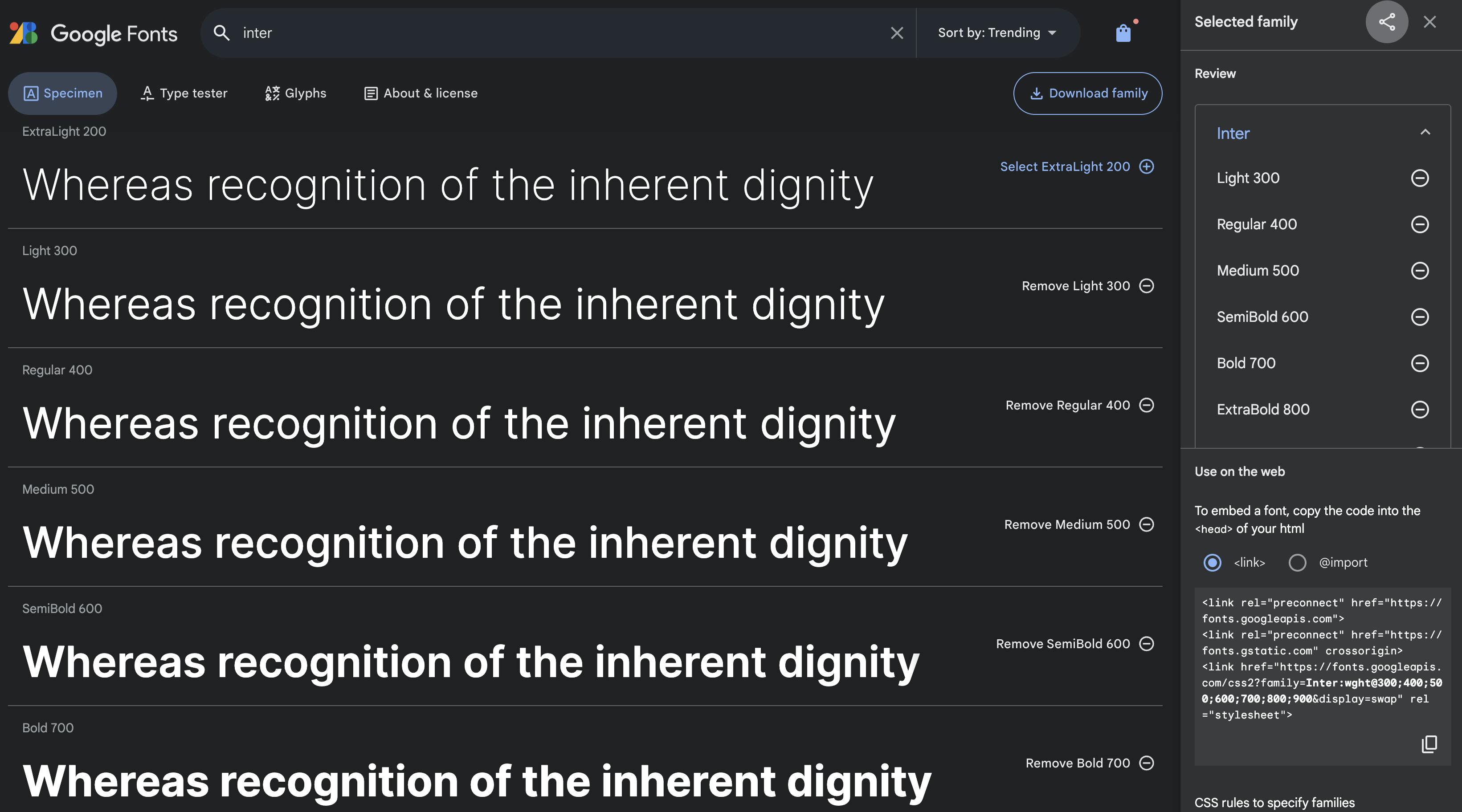
In addition to my custom local font, I also wanted to load up a Google font as well. I was familiar with this process with my experience in plain HTML and CSS, but I’d never had to set this up using Tailwind. Luckily, the process was pretty much the same aside from one key difference. To get started, I selected my Google font, Inter, and added all the styles I wanted.
Now, I could copy the code that Google provides, and insert it directly into the head of my index.html file.
//in index.html

<!doctype html>
<html lang="en">
  <head>
    <meta charset="UTF-8" />
    <link rel="icon" type="image/svg+xml" href="/vite.svg" />
    <meta name="viewport" content="width=device-width, initial-scale=1.0" />

<!-- Google Font Files -->
    <link rel="preconnect" href="https://fonts.googleapis.com">
    <link rel="preconnect" href="https://fonts.gstatic.com" crossorigin>
    <link href="https://fonts.googleapis.com/css2?family=Inter:wght@300;400;500;600;700;800;900&display=swap" rel="stylesheet">

  </head>
Finally, I had to make one more adjustment – once again, back in the tailwind.config.js file. Here, I just added to my existing fontFamily object, giving this font the key of body. That way, any time I added a className of font-body, I could easily use this font style in my project. Don’t forget to also set a fallback font style, like sans-serif!
//in tailwind.config.js

/** @type {import('tailwindcss').Config} */
export default {
  content: [
    "./index.html",
    "./src/**/*.{js,ts,jsx,tsx}",
  ],
  theme: {
    fontFamily:{
      'display': ['WigglyFont'],
      'body': ['Inter', 'sans-serif'],
    },
    extend: {},
  },
  plugins: [],
}
Now that my fonts were up and running, I could use them throughout my project!
Experience Using Tailwind & In-Line Styles
I’ll start off by saying that the Tailwind docs are FANTASTIC. They were a huge help to me as I was learning, and you can basically search any kind of styling that you want to add and easily see how to implement.
Overall, my experience was incredibly positive. I loved how quickly I could set up margins, padding, borders, and font sizes - directly within my React code. Designing within specified constraints also helped me keep the design on my website pretty consistent, and making responsive alterations using the md: lg: and xl: tags was really useful. This was also the first time I really followed the “mobile first” approach, as all styles without those tags default to the smallest screen width. So after designing my entire site at the smallest size, I could slowly work my way up to larger sizes, quickly changing padding, margins, and font sizes as I went.
Takeaways From Using Tailwind
Setting up an initial wireframe for my React components was super helpful, and allowed me to start thinking about styling components.
I was super impressed with how quickly I could “design” with code using this framework.
I actually loved being able to write all of my styles in-line, instead of having to come up with hundreds of class names while switching back and forth between my React code and a CSS file.
Since this was my first time learning how to use Tailwind, I gained more experience with it over time.
As I gained experience, I realized that my earlier code was a bit of a mess, as I did not follow some of the best practices, such as a utility-first workflow, that I learned later on.
This meant that I had to go back and refactor a lot of the earlier code - although the styling worked both ways, I wanted to keep my code clean and easily readable.
Overall, I’m incredibly happy with how my first React project turned out, and it was really fun to finally get some experience designing with code!